“It’s not enough that we build products that function, that are understandable and usable, we also need to build products that bring joy and excitement, pleasure and fun, and yes, beauty to people’s lives.” (Don Norman: Emotional Design)
― Donald A. Norman
Ever wonder why inexpensive wine tastes better in expensive glasses?
Why did Macintosh computer sales surge after Apple unveiled the eye-catching iMac?
In his interesting book, Donald Norman adequately explains how recent research on emotion and cognition has revealed that appealing objects actually do function better.
From our propensity to spend thousands of dollars on Gucci bags and Rolex watches to the impact of emotion on the everyday products of tomorrow, Emotional Design explains the significant significance of the sentiments that objects create.
Use emotional design because it’s effective.
There are several advantages to using Emotional Design. If used correctly, emotional design can have three significant effects on users and their product experiences:
- The product becomes well-liked: They adore it. They enjoy it and talk about it. Product teams underestimate the value of a happy customer.
- Bug tolerance increases: Positive thinkers are more optimistic. When customers are happy, they are more willing to overlook product flaws. An example is Chrome’s offline animation. Who could be bothered by that dinosaur?
- Emotions overrule Reasoning: We buy things we want even if our rational minds tell us they’re too expensive. We prefer beautiful and enjoyable things.
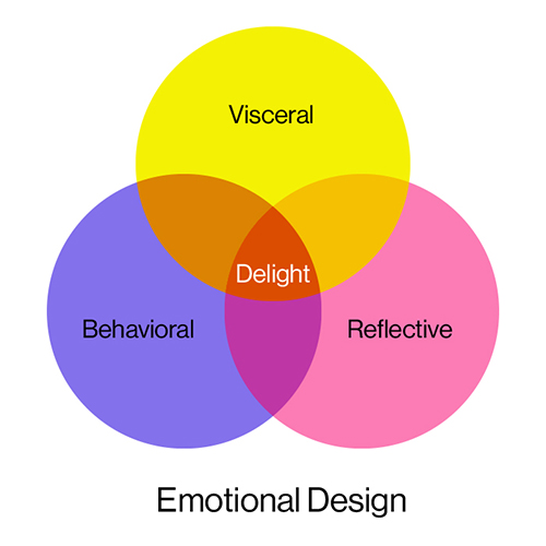
Layer one: Visceral design
Remember strolling into a mall and passing by an apple store? That moment when you couldn’t resist entering inside because it was futuristic, gorgeous, warm, and friendly.
Visceral layer actions/emotions are subconscious and uncontrollable. When you first see an app or website, this layer is activated. Users prefer novel or unexpected things to gross ones. You can be taken to an exhibition of luxury automobiles, where you’ll anticipate the fragrance of fresh leather and the vehicles’ cool curves.
This level has nothing to do with usability, effectiveness, or understanding. Attraction or repulsion drives brilliant designers’ aesthetic sensibility.
Layer two: Behavioural design
As soon as you entered an Apple store, you tried to touch and feel every item inside. In your hands, each one felt fantastic and totally unique. The best part was when you started using the new iPhone and generally explored every new gesture that Apple had developed before you couldn’t help but buy an iPhone.
Behavioural design = a product’s usefulness.
Behavioural design is perhaps the easiest to measure, since performance levels may be determined by adjusting or controlling an object’s physical or usable properties.
When things help us, we’re joyful. When products restrict, shift, or need close attention, we feel bad.
Positive behavioural reactions empower users, boost confidence and reliability by directly correlating user behaviours with the expected value, and encourage repeat reactions because people want to experience that delight again.
SIMPLE!
Layer three: Reflective design
Sharing your “Apple store” experience with others because the whole thing was so incredible and beneficial. The reflective layer is what people do to reflect on their experiences in the form of stories.
The most potent design layer is this one. Overall, the reflective emotional design encapsulates the product’s significance, the influence of thoughts, the shareability of the experience, and the cultural resonance
The reflexive level is connected to conscious cognition, where reasoning and conscious decision-making occur, unlike the other two levels. Again, introspection at this level is gradual and in-depth in contrast to unconscious thought.
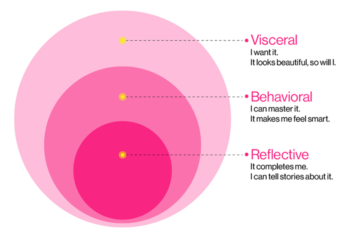
How to Increase Emotional Impact
Designers must foster appropriate and uplifting emotions for each stage in order to produce pleasurable experiences (visceral, behavioural, and reflective). Here are some pointers for developing that optimism:
- Personalization & Customization – Make the user experience unique so that your customers feel like they are in control. Permit people to personalize their experience so that it becomes an expression of who they are.
- Use relatable pictures, drawings, and animations when creating your content. The visuals alone can convey emotion and encourage empathy in your audience.
- Positive Surprise – Surprise and please your users to elicit positive emotional responses.
- Humour: Laughing and joy are particularly potent pleasant emotions that help to reduce fear and uncertainty while bringing about a sense of happiness.
- Storytelling – Assists users in comprehending the experience’s journey, framing their interactions, and remembering those encounters long after using the product.
Good design makes you happy
In this 2003 discussion, the three ways that good design makes you happy, design critic Don Norman examines design that makes people happy with his sharp eye for beauty, humour, enjoyment, and emotion. He identifies the three emotional cues that a successful product needs to hit.
A must-watch 😉
Writing Credit – Drishti Shah

