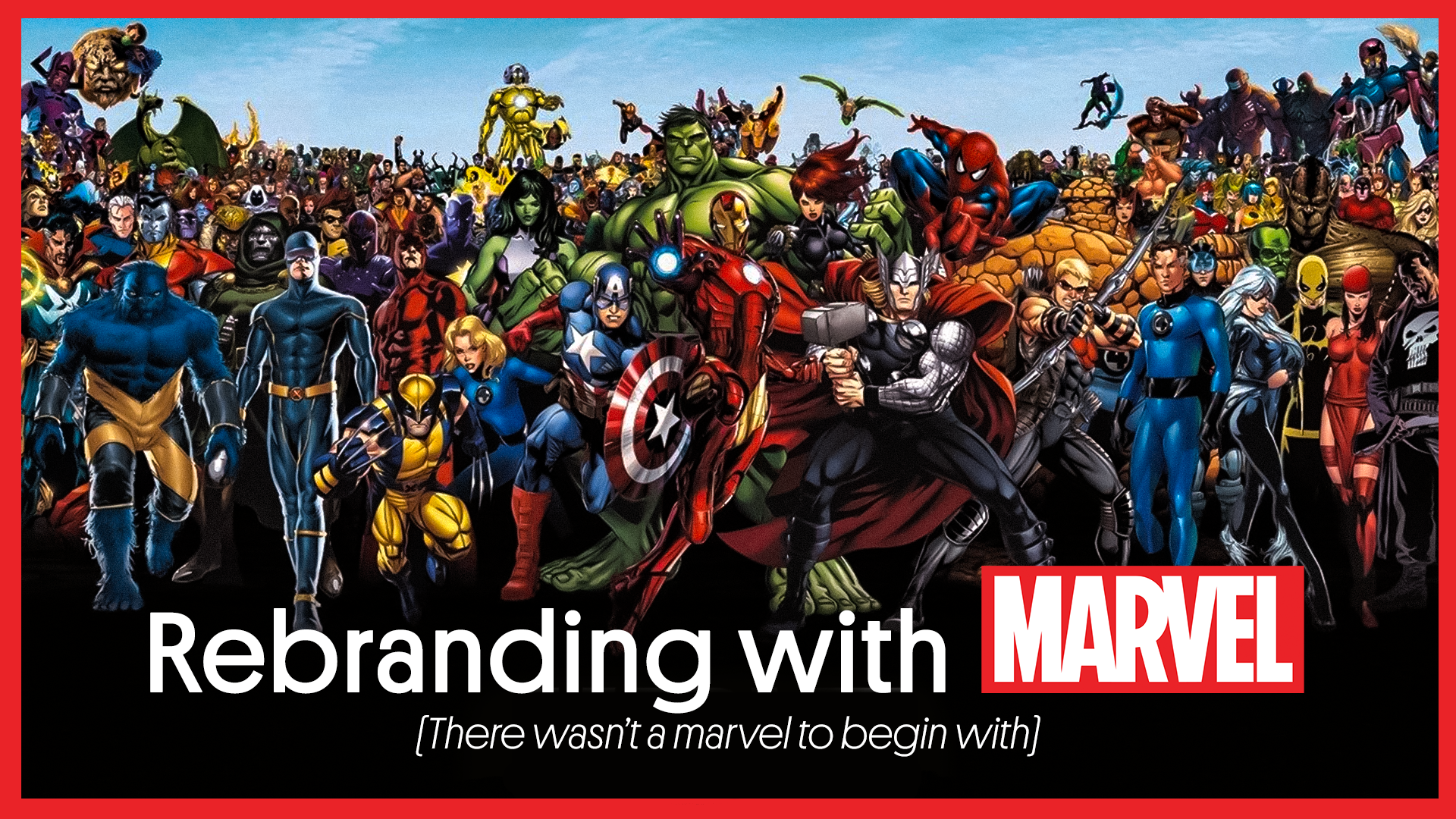
Because of the multibillion-dollar superhero movies, Marvel has attracted the attention of the general population. The brand’s logo has undergone a few revisions throughout the course of its 77-year history before becoming so well-known.
The Marvel brand is now nearly always noticeable, and it allocates a sizable budget to marketing campaigns and brand extensions.
If details were what made a brand, Marvel would be it. Today, we’ll talk about this company’s logo and how it came to be one of the most potent in the world. By examining the growth of the Marvel logo, we hope to motivate you to move beyond this case study and recognize what your images require to be approachable, identifiable, and simple to recall.
Rebranding: A few times over
There wasn’t even a Marvel, to begin with.
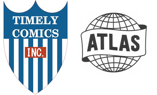
Martin Goodman created the brand in 1939. Timely Comics was an underground comics company. Back then, comics were golden. The Timely logo was a white-and-blue coat of arms with INC in red. The logo appeared in books for 11 years.
Marvel rebranded as Atlas in 1950. The logo was a globe with a ribbon around it. Brand representatives must have wanted to raise awareness, and they did so well. The logo showed a corporate name.
A history of superheroes and logos
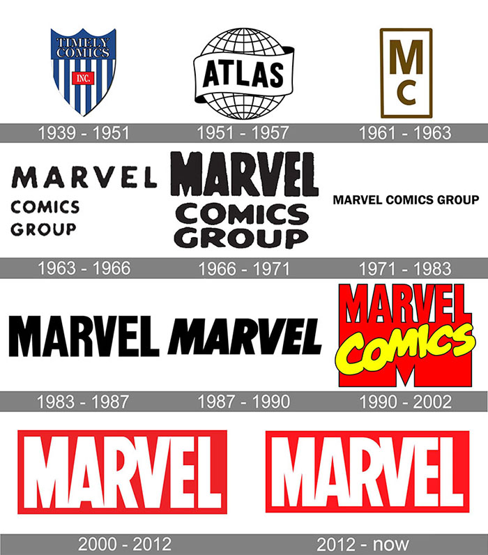
Marvel Comics took time choosing its logo. Before renaming, Marvel Comics used a different logo. “Marvel Comics” was written in white on a red background with a wheat leaf. Later, in the early 1960s, a simpler form consisting of “MC” printed over each other was forgettable but stood out because several comic books from that period just had “MARVEL Comics Group” in black letters.
“Marvel” and “Marvel Comics Group” were distinct sizes and fonts throughout the 1970s and 1980s. Early 1990s Marvel logo change. “Marvel” was now in red and black letters that formed a “M” “Comics” was placed in a quirky script over the large “M”
Marvel Comics introduced a new Ultimate Marvel logo in the early 2000s: “Marvel” in a red box. Simple logo. Marvel Comics used it for other comics after its success. This Marvel Comics emblem debuted in early MCU films, making it more recognizable. As Marvel Comics continues to reinvent itself, this edition may be replaced in the future.
Every Marvel movie has a punchline, so does this
The logo’s Comic-Con release included fanfare. Michael Giacchino scored The Incredibles, Star Trek, and Lost. These marketing campaigns teach us branding lessons:
- If you haven’t launched your brand, make a simple logo. Simple means adaptable, memorable, and appealing. Create your own professional-looking logo. Don’t overdo it.
- When the mainstream audience likes you, change your message, tone of voice, and images. Consistently.
- Brand extensions shouldn’t hurt your brand. Connecting side items to your core brand, service, or product helps customers recognize them.
- Consider context. Disney bought Marvel Studios before the logo was released. The 2009 deal was announced. MARVEL studied superhero movies extensively. The latest is Black Panther. Over $80 million was made worldwide.
- Marvel’s story is written and positive. The brand has become one of the world’s most recognizable
- DC’s rivalry is still active. In the interim, the brand works on details, goods, movies, marketing campaigns, and collectables. Learn from this visual branding tale and create a famous logo.
Is rebranding for you?
What’s better than spicing things up a little?
Our team at Palette69 is skilled at adding Jazz to the blues. In short, get in touch with us to view your brand in a new light.
Writing Credit – Drishti Shah

