What is product usability and how do giants like Google, Apple and Nike ace it?
Form Follows Function.
American architect Louis Sullivan used this phrase for the first time in 1896 in his article The Tall Office Building Artistically Considered. According to Sullivan, the form of a building should be guided by its purpose – its intended use. This was a revolutionary step in the world of architecture where buildings were still trying to emulate the form and aesthetics of ancient Greek and Roman structures.
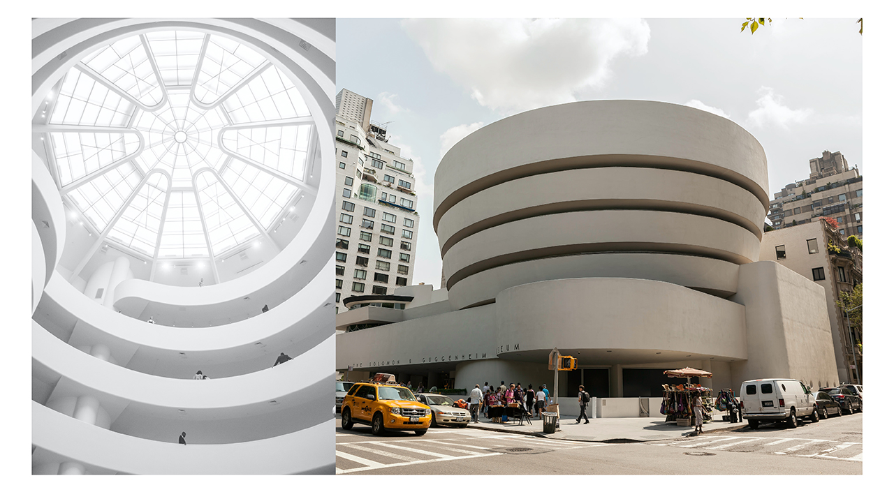
Louis Sullivan’s protégé, the famous architect Frank Lloyd Wright extended his mentor’s teachings and said “form and function are one”. He, hypothetically, carved this phrase in concrete in the Guggenheim Museum, New York in 1939 where space is designed to have the most seamless experience of appreciating paintings and artwork
 Now, what’s interesting is that a century after Louis Sullivan’s famous article, Jakob Nielsen, Ph. D. wrote the 10 Usability Heuristics for User Interface Design in 1994. In this article, he highlights the importance of designing usable products; usable being defined by ‘the ease with which a person can accomplish a given task with your product.’ With over 70 United States patents under his name for solutions that make the internet more usable, Nielsen has proved to be the ultimate torchbearer for leading usability in web design.
His 10 Usability Heuristics can be seen in the evolution of the homepage design of many brands like Google, Apple, Facebook, eBay, Nike and Lamborghini. Given the lack of experience in the field of human-technology interaction in the 90s, the first version of the homepages of these brands looks cluttered, like there is an information overload that the user must wade through to find what she is looking for. Those designs were neither usable, i.e., they did not easily help the user do what they intended to do, nor were they user-friendly, i.e. they did not create a good user experience because of how disconnected the designs were from the user psychology and user journey.
The subsequent designs, on the other hand, have a clear structure with user experience and usability at their forefront. For instance, today, when we start typing something in Google’s search bar, or even the Dropbox, Quora, or YouTube search bars, the initial words that we type immediately prompt options that minimise the load on our memory. This is Nielsen’s 6th usability heuristic – Recognition rather than recall.
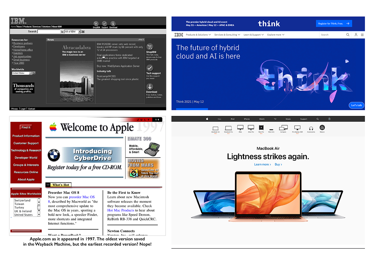 Similarly, the 8th heuristic is Aesthetic and Minimalist Design. This one is really easy to identify just by comparing the first official homepage of these brands to their most recent one. In the latest version, Google prioritises the search bar, YouTube prioritises the search bar and recommended videos, Apple prioritises its latest product and so does Nike. Everything other than the priority is either completely deleted from the page or put into a drop-down menu. Amazon on the other hand is less minimalistic. In fact, their usability depends on the user finding multiple options for what she is looking for in addition to easily finding and buying that 1 thing that she knows she wants. The website is thus, about easily navigating through the plethora of options. Amazon’s usability standard is seen in the user journey even after the user has placed the order – she gets regular status updates. Such feedback is a critical feature that directly ties into usability heuristic 1: Visibility of System Status. Amazon’s usability loop is completed with the complaints journey where the user can return the product with the click of a button. With minimal effort on the aesthetics, per se, and allowing the function of each page and every piece of information to guide the form, Louis Sullivan would be very satisfied with Amazon’s rendition of Form Follows Function.
While architecture does not have the privilege to test how well its form fulfils its function before building the structure, when launching your product it is imperative to include usability testing as a part of your iterative design process. By testing for learnability, efficiency, memorability, errors, and satisfaction—the 5 broad areas as identified by Jakob Nielsen—you can know, before launching the product, how well it fulfils its intended purpose. Steve Krug, author of Don’t Make Me Think and an expert on user experience and usability even jests, “Whether you do the testing or not is far more important than whether you have the right participants.”
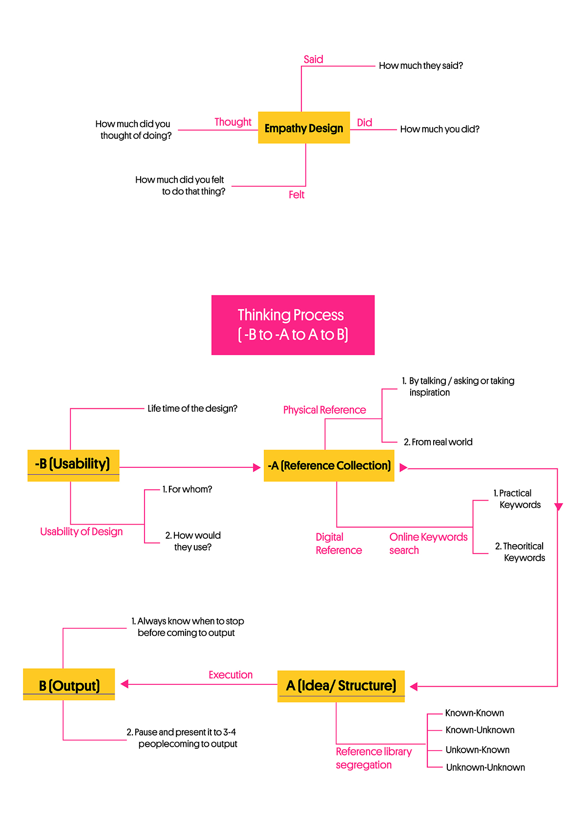
When you brace your user research based on a detailed understanding of the persona, user journey, user pain points and needs with timely usability tests, you will make a product that is as close to your user’s perception of success as possible. The test will make it clear how humans react differently to the same thing when presented in different ways. A deep understanding of how humans perceive and absorb the information presented on a screen will help you further streamline the order, flow and representation of information. Finally, designing with such empathy will help you develop a product that is accessible and functionally efficient, i.e. it will fulfil what it promises to do.
We do not know if Jakob Nielsen was inspired by Louis Sullivan’s article on Form Follows Function when he dedicated his career to developing usability principles. But, the overlap makes it very clear that if your product is designed for users—be it a building, an app, a website, or a 3-dimensional product, it has to, first and foremost, successfully fulfil the purpose that the user expects it to fulfil. Because its usability can truly make or break your product.
Writing credit – Vishanka

