Did you just think about getting a tattoo? Or curating an aesthetic presentation for your meeting? Wait, Did you just design an album cover for your new song release? Or are you designing a website and fancy packaging to sell your products? Everything has one thing in common – text and the need for a good font style.
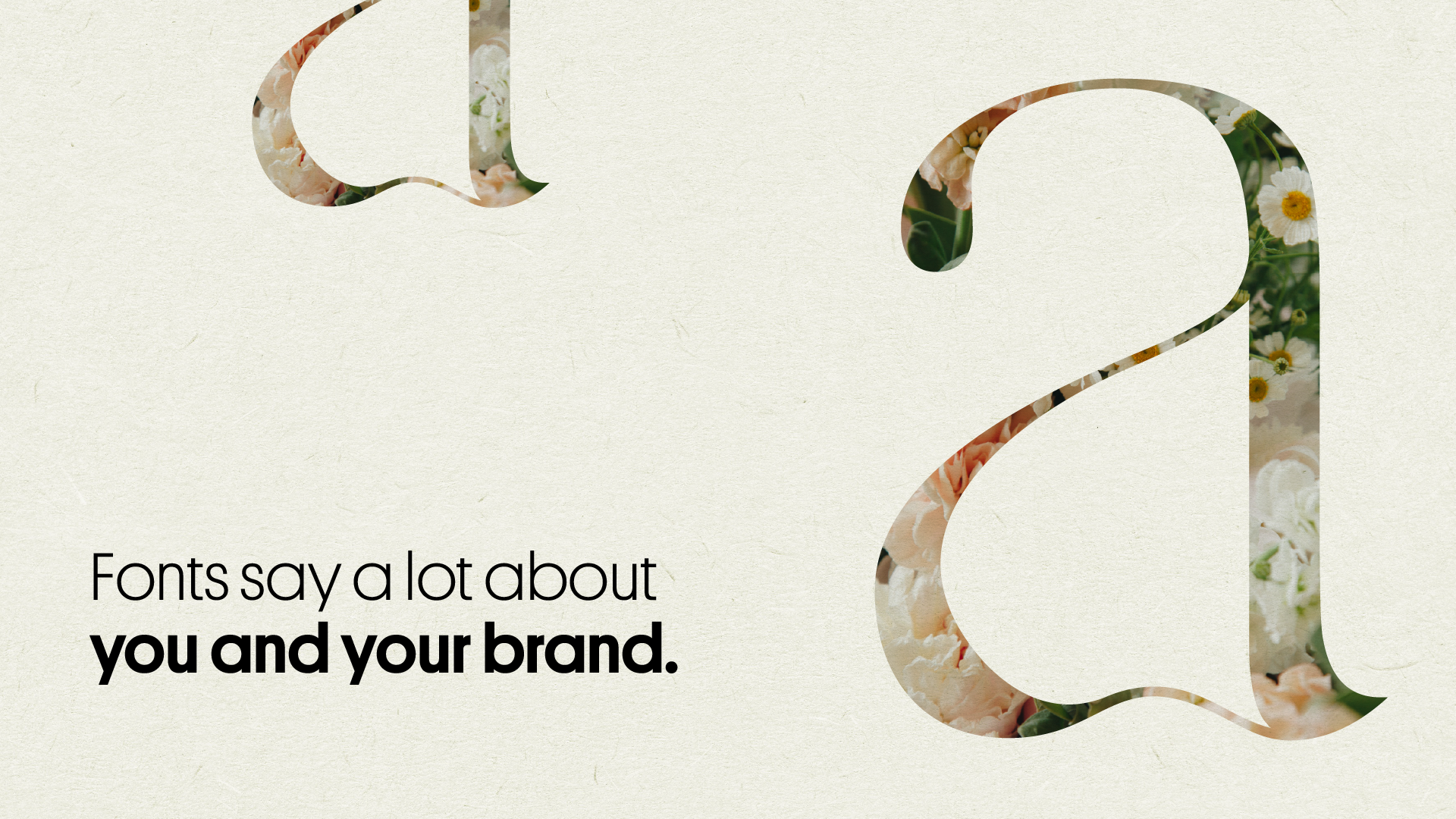
All of us have that one favourite font, but, does it go well with your brand? Let us understand what your font says about your brand.
The three most common fonts:
1. Script font
If you’re a fan of aerated drinks, Coca-Cola’s logo must be printed on the back of your mind. That is the best example of script font: a type of handwriting that resembles handwritten lettering.
Script fonts are more likely to elicit creative and emotional responses from your audience, making them more likely to connect with your brand. From Coca-Cola to Instagram, script font does have a lot of followers.
2. Serif font
Ever seen a print of the new york times? That’s serif
A serif font is the most traditional typeface. Their use dates back to when printing was invented. It’s best to use serif fonts if you want to portray your company as well-established.
Serif fonts are ideal for high-end or authoritative brands because they convey trust and respect. The New York Times, Dior, and Gap are all well-known companies that have serif fonts in their logos.
3. Sans serif font
Chances are, you landed here via google. Also, Google uses sans serif.
It’s easy to read sans serif fonts because they are clean and modern. When you remove the decorative elements from your lettering, it creates a clean and uncomplicated look.
If you want to convey a sense of honesty and simplicity, sans serif fonts are the best choice. A few notable sans serif fonts include Chanel, LinkedIn, and Google.
The battle begins
Legibility vs. aesthetics
Serif vs. sans serif has long been a source of debate among designers.
The use of a serif font has long been associated with more venerable, time-tested companies. In contrast, sans serif fonts are seen as approachable and “clean” by many, which is why we see them used by Facebook and other similar organisations.
If you’re looking for an example, the term “slab serif” refers to a thicker typeface that was popular in print media because it was easier to read on cheap paper. It was much easier to read because of the heavyweight.
In contrast, sans serif is more commonly associated with digital media because it allows for more space between letters without the little strokes.
Lowercase vs. uppercase
Consider Amazon and Facebook as examples. Traditional grammar rules don’t apply here because these are all lowercase. In Pascal or Camel’s case, new words are introduced with a capital letter and no spacing, which may be preferable for some. Think of YouTube or EasyJet.
Readers lauded the “American lowercase experiment” as progressive and modern when conventions were challenged and replaced with non-capital letters. It’s fashionable these days for start-ups to defy the rules of the game, and this is how many of them operate. Irreverent. Bold.
Using images as a medium
Typefaces can be personified by giving them human-like shapes to make them stand out from the crowd. Although it should only be used with logos, this is a great way to distinguish a brand.
As a result, they’re perfect for businesses like delivery services or automobile manufacturers.
Now what?
- Recognize and specify the unique character of your company’s brand.
- Each typography has its own unique characteristics and personality that can be matched to a specific brand.
- Make a choice between free, paid, and custom fonts available online.
- Consider the legibility, flexibility, and compatibility of the fonts you select with your other brand elements before making a final decision.
- Create a font hierarchy and include it in your brand manual.
Writing Credit – Drishti Shah


