
The logo is derived from an infinity symbol to highlight that the company strongly believes in co-operation. The two mirrored symbol juxtapositioned at each other carve out the design story of selection along with the individual staged at the centre being the attraction of
the logo.

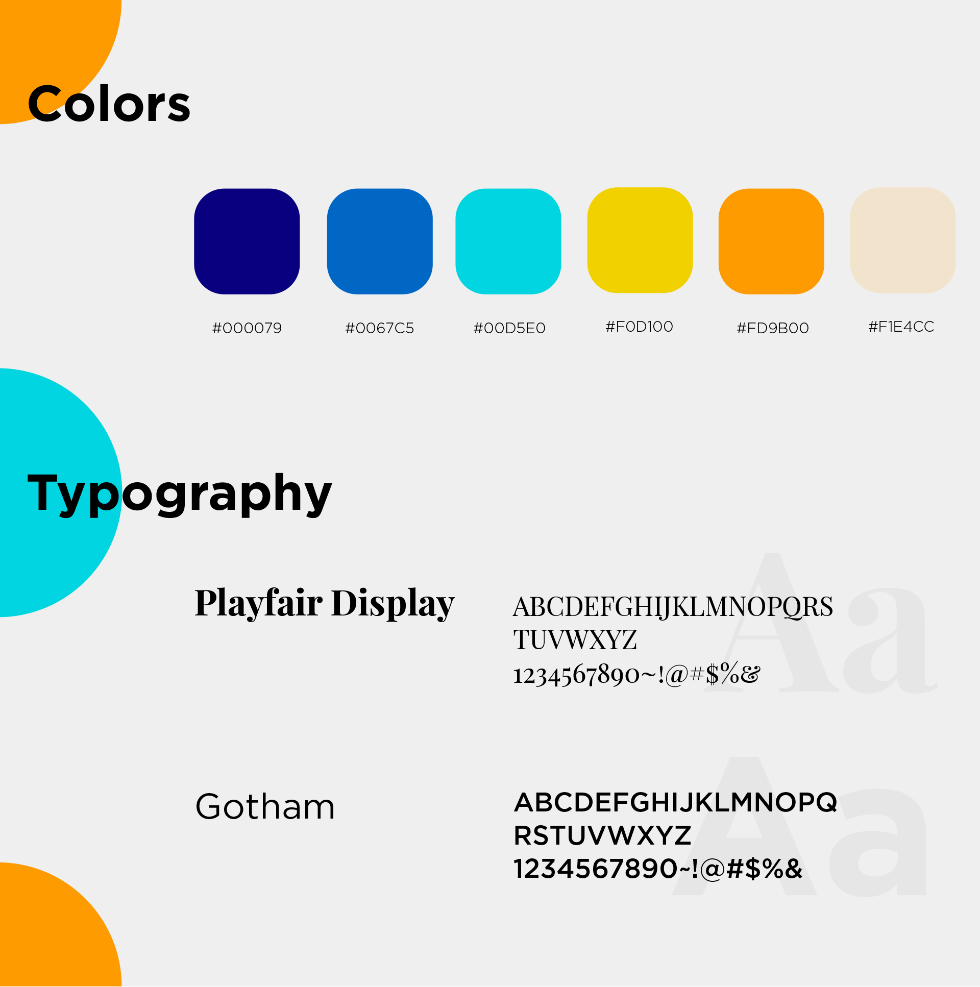
The fonts adapted establish a minimal and clean approach towards the identity making it relatable and consitent with a vibrant colour palette that gives the brand a bold and energetic look.
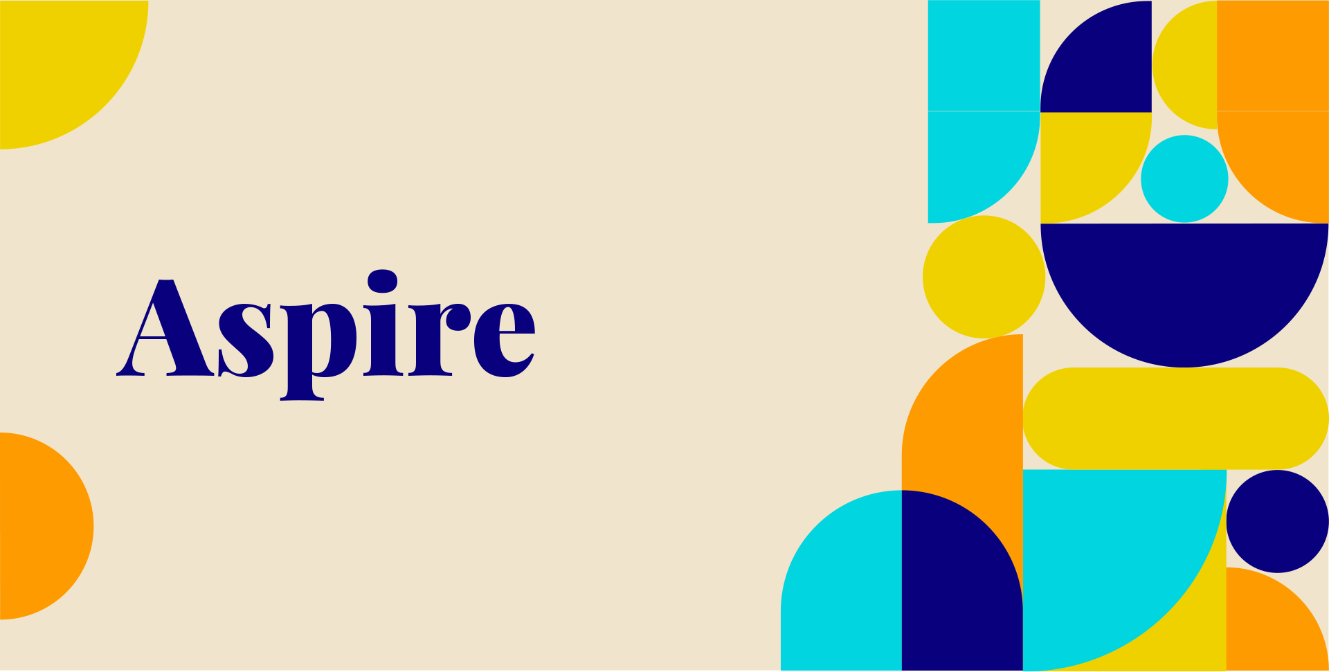
Palette69 team created a chromatic design system that empowers, nurtures, and brings attention to sharp talents all across the globe.
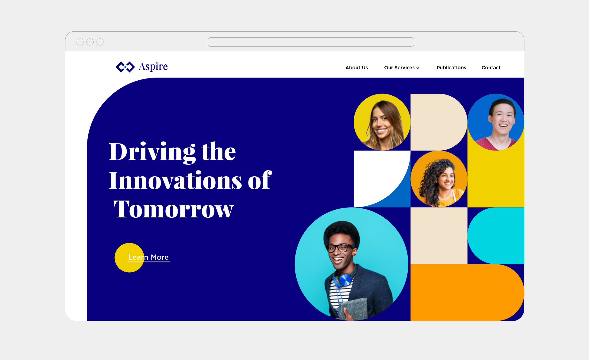
The picturesque blend of bold and vibrant colors with dynamic shapes and patterns translates a seamless bridge between diverse profiles stepping foot into the world of Aspire.
Feel like sharing our work? Here you go.
Next project