Delve into the stimulating realm of UI design, where every single pixel counts and each colour bears significance. In this modern age user interface design enjoys a crucial role in any online business venture. It goes beyond mere aesthetics; it entails creating an immersive experience that captures user attention and guides them to their desired destination. And this is exactly where UI design science steps in.
Digital nudging is undoubtedly one of the most intriguing aspects of UI design – its subtle tactics influence user action without them even realizing it! It operates through tiny details that steer users gently towards favourable outcomes – think of it as a well-placed nudge in the right direction! Digital nudging relies on behavioural economics principles that suggest even small adjustments to decision-making settings can have profound impacts on user behaviour.
Digital nudging has found relevance across domains ranging from e-commerce to healthcare and organizational information systems.
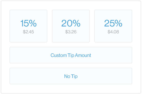
This technique influences decisions by modifying what’s presented or how it’s shown just at the point of the decision. An excellent instance of this approach can be observed with Square’s mobile payment app: their tipping function comes enabled by default which spurs users digitally towards leaving a gratuity.

Credit: Quartz
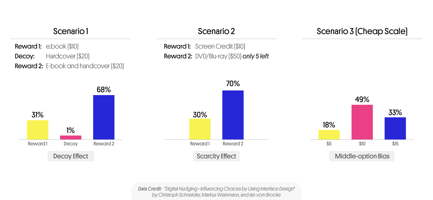
When it comes to deciding between options on digital platforms like reward-based crowdfunding sites small cues can have outsized impacts on which ones we choose – referred to as digital nudges. In order to investigate this phenomenon further researchers undertook studies incorporating three different heuristics and biases: the decoy effect, the scarcity effect, and the middle option bias. Specifically, they wanted to learn how these techniques would affect supporter behaviour on these platforms. By using less attractive choices to elevate the attractiveness of others (decoy) leveraging limited availability to create demand (scarcity) or making central options appear optimal (middle option bias) researchers sought to reveal the power of digital nudges in shaping our preferences.

Alterations in behaviour or attitudes are the primary aims of persuasive technology modalities like digital nudging. With insight into heuristics and cognitive biases, web designers can create intuitive user interfaces that guide individuals toward favourable outcomes. Regardless of the social benefit, these interventions might offer they must be transparently delivered while complying with ethical standards; users’ choice in receiving them cannot be overlooked.
Digital nudging can be seen in various situations such as websites automatically selecting the “subscribe” option when filling out a form. The default effect here means people are more likely to stick with pre-selected options rather than make conscious decisions on their own accord. Essentially by using this approach websites are unconsciously guiding users towards subscribing. Another technique used by sites involves social proof which displays how many individuals have already purchased a product or service – essentially showing others have already made similar decisions before and increasing credibility/trustworthiness.
This subtle hint encourages other potential customers towards making similar decisions for themselves.
It’s essential to note that digital nudging isn’t about deceiving users into performing anything they’re not interested in doing; instead, it focuses on creating positive experiences by steering individuals toward preferred outcomes naturally. A website with straightforward and concise language on its call-to-action buttons increases its chances of converting users compared to those with vague and confusing language. The bedrock for any thriving business model lies firmly embedded amidst implementing viable marketing techniques directed at heightening brand awareness among ideal target consumers. The trick lies in devising a strategic marketing blueprint aimed at meeting the evolving needs of customers consistently.
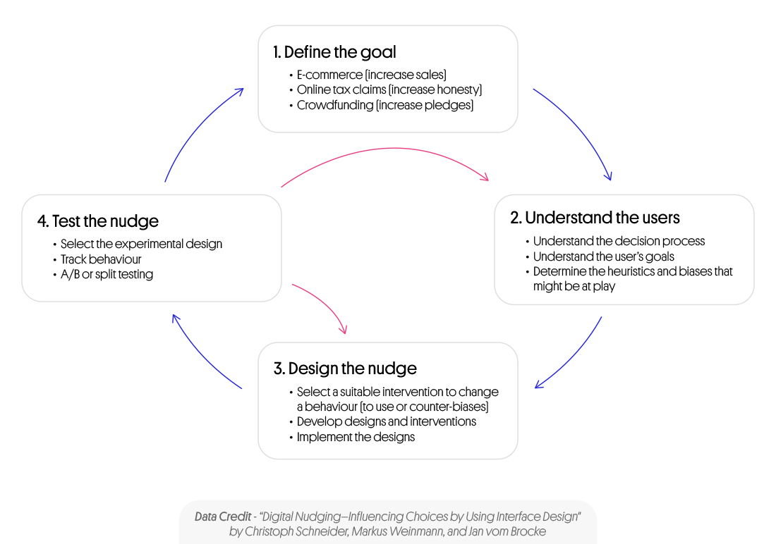
To create effective digital nudges there’s a precise process you need to follow-
Step 1 – Define your target customer
In order to design an effective digital nudge the first step is to clearly define the desired target behavior. This could be anything from encouraging users to sign up for a newsletter make a purchase, or share content on social media. By pinpointing the specific behavior you want to influence you can ensure that all subsequent design decisions are aligned with this goal.
Step 2 – Identifying Relevant Heuristics and Biases
When looking for ways to direct users towards your target behaviour, identifying pertinent heuristics and biases is essential. These mental shortcuts allow individuals to make decisions despite uncertainty or complexity while deviating from rationality standards. Once identified, incorporating these mental tools into design elements creates interfaces catering to human tendencies improving desired outcomes’ likelihoods. The scarcity heuristic highlights how people tend to buy more when products/services offer limited availability; by using phrases such as “only a few left in stock” or “limited time offer,” increased purchasing action can be encouraged.
Step 3 – Picking Appropriate User Interface Designs Elements
The essential part is choosing user interface design elements that guide users towards target behaviour. These components can consist of graphic design, specific content, wording or small features that affect how information is perceived and processed by people. For example, using bright and contrasting colours for a call to action button draws users’ attention resulting in increased clicks whereas concise wording reduces confusion levels while boosting click potential.
Step 4: Assess the Digital Nudges Impact and Ethics
As the final step, it’s crucial to evaluate both the effectiveness and ethics of your digital nudge. Of course, achieving your desired behaviour is important but it’s just as critical to ensure that your nudge is ethical and transparent. For instance, if you’re implementing social proof to encourage customers to make a purchase it must be genuine and not misleading. Furthermore, users should have the option to opt out of any nudges if they wish.

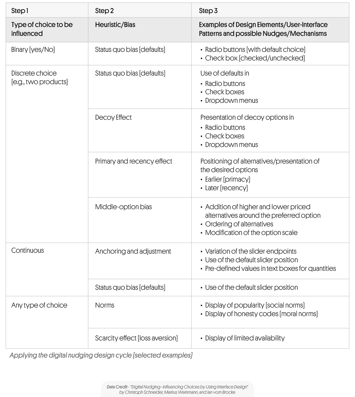
For today’s savvy designer looking to influence user decision-making at low cost with minimal disruption, digital environments offer myriad possibilities for behavioural nudging via simple interface modifications like default settings or element displays that show some choices more prominently than others or provide feedback on others’ actions. Furthermore, designing digitally allows real-time changes in available options based on distinct user characteristics – yet any intervention should harmonize with best practices already laid down so as not to compromise usability and consistency across platforms – always remembering that this practice carries tremendous potential if approached skillfully.
The table below shows some examples that designers can take reference from:

Although digital nudging has proven effective in driving business outcomes, ethics must not be overlooked in implementation. Users should always have transparency regarding any applied nudges and a choice in opting out if they prefer.
Ultimately the science of UI design presents an interesting and ever-changing realm. Integrating digital nudging into your overall approach enables you to fashion a positive user experience that steers individuals towards success with ease. Don’t forget to consider subtle yet significant elements of your designs as you create websites or apps for optimal results.


