 works
works

 Listen to this article
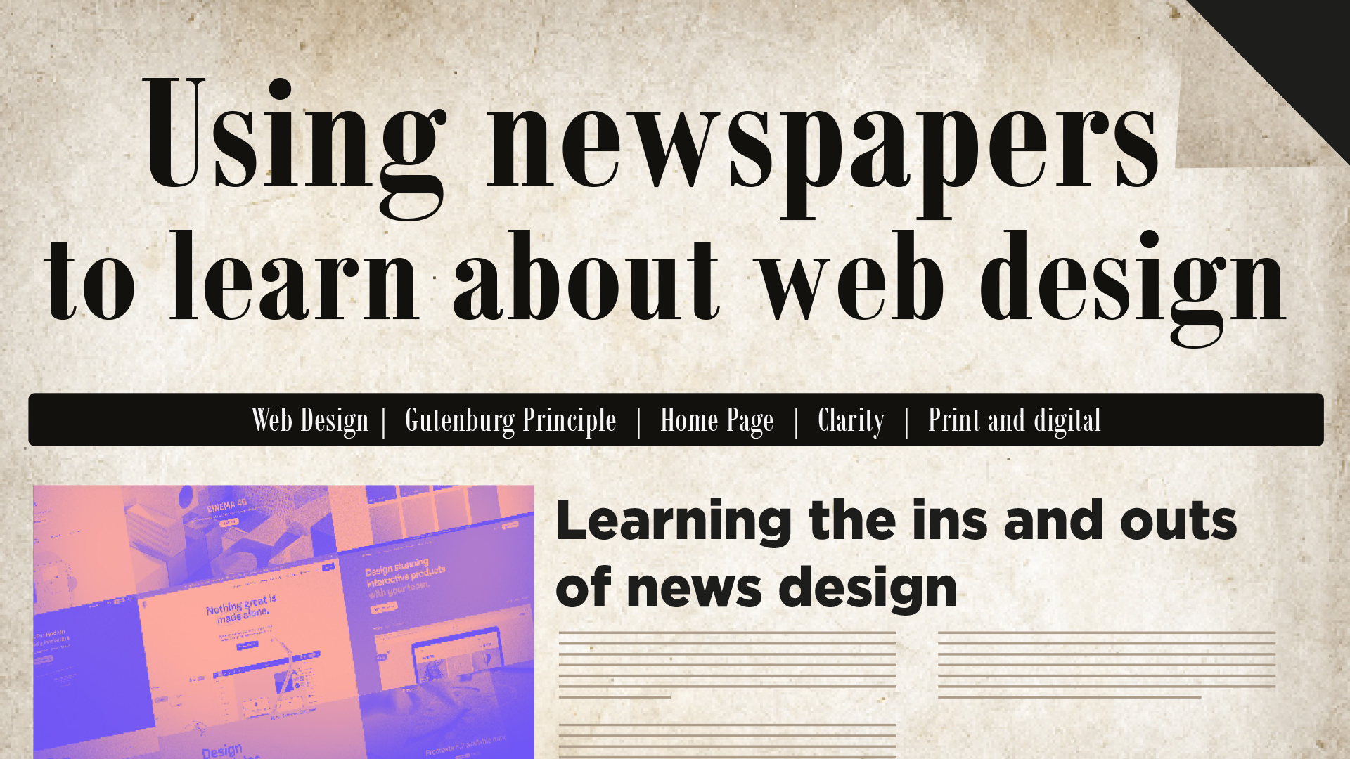
It’s simple to become obsessed with what’s “in” at the moment in terms of web design. With the evolution of the web, developers now have access to various tools. A result is a place that is forward-thinking and innovative (as it should be), but also potentially rootless. Ancient masters exist in every discipline. Sites like these are analogous to traditional print media like newspapers.
When breaking down the fundamentals of news layout, web design has many similarities that might be difficult to differentiate. Much of what we now know to be good practices in web design have their roots in newspaper layout. To put it simply, the point of a website is to have visitors interact with it and, ideally, come back again. Newspapers have successfully played this game for ages.
Learning the ins and outs of news design might be helpful for anyone interested in web development.
The Home Page
Nearly all of the content we read about in the newspaper today won’t be there tomorrow. What readers don’t immediately notice plays a crucial role in organizing the news.
In newspapers, structure and the way in which readers absorb data are of paramount importance. As time goes on, I think it will become obvious how similar this is to web design, and what it means for us.
Above the fold
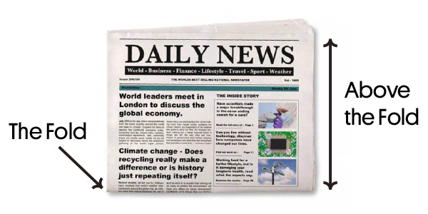
‘Above the fold ’ refers to the content you see when you land on a web page. It’s an old newspaper word. Due to their size, newspapers are commonly piled and folded in half, hence above the fold denotes content above the fold.
First impressions matter!
If the front page isn’t interesting, why buy the paper?
Above the fold is where the paper’s lead story appears. Hook the reader. Big headlines, vital information, and striking pictures are examples. No rigid format exists. Whatever attracts people without twisting the facts wins.
The same is true for websites, hence the nomenclature. ‘Above the fold’ in web design is the website’s “What should everyone know?”. This applies everywhere, especially at home sites.
‘Above the fold’ is the most viewed portion of a web page, with engagement rising below. In the news, e-commerce, and social media, be direct.
The infamous Gutenberg Principle
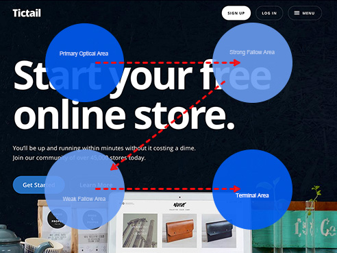
The Gutenberg Principle outlines how the eyes move through an evenly scattered design. The Gutenberg Rule or Z pattern of processing.
Newspapers follow this principle sincerely.
Visual designers should know that the viewer’s eye travels throughout the design surface looking for visual paths, landmarks, and resting points. By strategically placing items, the designer controls the order information’s path of travel (shapes, lines, colours, textures, etc.) More of these characteristics will be found by a skilled eye, increasing engagement.
If designers want the audience to linger, they must provide a path. Print, web, motion, and UX need this.
The Gutenberg principle presupposes a 4-quadrant design space. Top-left and bottom-right are active. Left and right are passive. Top quadrants trump bottom quadrants. Left-to-right readers (English, Spanish, etc.) enter at the top left and flow diagonally to the bottom right. This is a natural eye path. Right-to-left readers may mirror it.
The designer can use this natural Z pattern or propose different entry and exit options. If he follows the Z pattern, he reads gravity from top to bottom. He’ll place vital features and emphasis areas along the route. This improves comfort and comprehension.
This natural pattern’s disruption guides the eye around the design. If a major feature is put in the bottom centre, the eye will enter the design there.
This information is useful. Trends, not rules. Strong news design leverages the Z-pattern as a basis, not a rule. Web design is similar. Remember, but don’t worship. Great design leads, not follows, the eye’s reading gravitation.
Columns
Content-rich newspapers. They’re crammed with information that must be well-organized and presented. Newspapers use the grid system.
If each narrative fits neatly, it can be rearranged easily. This is a blessing when you have to cram dozens (or hundreds) of stories into a limited space.
Bad presentation devalues good knowledge. Blocks establish discrete, easy-to-follow pages within pages.
These web design principles have always been important, but they’re especially important now that we have a grid. Newspaper grid systems show how content blocks interact with each other and with advertising. The improper alignment can look foolish, while the right arrangement is enjoyable.
Differences persist.
Online, there are rarely column jumps since web pages can go down forever. This layout is counterintuitive online since it requires readers to scroll up and down to read a single paragraph.
Web designers may use jumps to stack material rather than organize copy.
Watch your clarity
These traditions were fashioned by decades — in some cases centuries — of experience, and there are plenty more. All of them boil down to content and how people will engage with it.
The best newspapers provide information as clearly, attractively, and easily as possible. That’s a worthy website objective.
The same goes for the content displayed on the website.
It’s a two-way street
The designers of newspapers are students of the web, and similarly, the designers of websites ought to be students of newspapers. Because advances in web technology give up previously unexplored territories, it is important to determine whether or not someone else has already been there.
At the end of the day, we are all searching for the same thing. It’s all basically just a different dialect of the same language.
Newspapers do not have all of the answers to creating a great website, but having knowledge of the concepts that guide them is beneficial to web designers.
Both of those worlds are filled to the brim with people who share your values and beliefs.
Writing Credit – Drishti Shah